A NEW VISUAL LANGUAGE IN ADVERTISING
|

|
Consumers expect clearness in advertising. Consumers have little time and want to be informed as quickly and efficiently as possible. Therefore ads usually communicate clear and understandable messages. The message in the ad is explained through an image, headline, body copy and, if necessary, a 'pay-off'. Anyway, that is how messages in ads used to be communicated. More ads seem to appear in magazines which deviate from this traditional 'ad schema'. Ads by Diesel, Levi's and PlayStation (see examples) are not so obvious, but seem strange and puzzling. A manifest message seems to be missing and verbal copy that explaines the image is absent. Researcher Berger (2001) mentiones this trend as a 'new visual language in ads': “...the new visual advertising tends to downplay verbal explanation… it challenges the audience to solve a visual puzzle…”. This trend towards more prominent images and riddles is often referred to in literature, but is hardly based on research.

|
Mysterious advertising
Many names are used to describe puzzling ads, such as 'absurd', 'indirect', 'post-modern', 'new-wave', 'original', 'ambiguous' and 'open' advertisements. According to Schreurs, author of 'History of ads in the Netherlands', this new form of advertising allows and challenges consumers to form their own interpretation of the message. Ambiguity and elusiveness are emphasized, mainly because of an increase in visual prominence and a decline in verbal copy. The reason why an increase in visual prominence and a decrease in verbal copy causes openness, is that images are prone to more diverse interpretations and verbal copy is used to guide the reader to a certain interpretation ('anchoring of the image'). The development of more prominent images and less verbal copy in magazine ads, is signaled by several authors, copywriters and art directors. For example, Herman Lafermeyer and Mark van den Bergh, both creative director for advertising-agency BBCW, claim they haven't seen any real 'verbal copy ads' for a long time: “Today, the 'visuals' tell the complete story. Trends nowadays are magazine ads without 'body copy', sometimes accompanied by a headline.
 |
Reasons for riddles
Because of the enormous amount of ads with 'similar' messages, little attention is devoted to these ads and consumer irritation towards these simple messages has increased. The new indirect way of advertising demands a more active role of the consumer, a role which, according to researcher Berger, will be appreciated by the consumer: “…people don't want everything spelled out for them… ads that take themselves too seriously -or underestimate the intelligence of consumers- are immediately prone to ridicule”. However, it is possible that the ad becomes incomprehensible: “One step too far and the message is not being understood. One step too short and the message is already known and therefore boring”, says ad-strategist Geurse. Studies have also indicated that an indirect approach can avoid counter argumentation. Because consumers have to search for a message, they more or less forget to question the validity of the retreived message. Another reason for the use of more prominent visual ads, is the rise of a 'visual society'. Nowadays, communication more and more takes place through images, because of their capacity to exceed language barriers. Therefore visual advertising can be used worldwide.
 |
Changes 1980-2000
Only few studies have researched and supported the trend towards more prominent images and a more indirect way of advertising. An American study, in which over 2000 ads have been analyzed from the period 1900-1980, showed that the use of images has increased and the use of verbal copy has decreased. Another American study, in which 220 ads have been analyzed, revealed the same results. The surface taken by verbal copy declined from 50% in 1910 to 30% in 1980. Not only the surface but also the content of verbal copy and images changed, became more less clear. The pictures were not described or explained in the verbal copy anymore. A content analysis of 1286 ads, drawn from twenty American magazines in the period 1990-1991, showed that approximately 15% of the ads are multi-interpretable or ambiguous. Rhetorical figures, like metaphors, are also frequently used. An American study showed that out of the 2469 analyzed ads from 1986 and 1988, almost 75% contained at least one rhetorical figure. A content analysis that analyzed 286 ads drawn from 1990-1991, showed that 85% contained a figure of speech in the headline. A study by dingena (1994) was the only study that content analyzed magazine ads from the netherlands. She has analyzed 300 ads from 1978 and 1988 and observed that more prominent pictures and (visual) figures of speech were used in 1988 compared to 1978. According to Berger, advertisers started to use visual riddles in the early eighties, but used these ads on a larger scale only a few years ago. Also according to Schreurs, magazine ads became more puzzling between 1990 and 2000. Little is known about changes in advertisements during this period. Previous research does not go beyond 1980 or does not concern magazine ads from the Netherlands.
 |
Research
The question is whether ads in the Netherlands indeed show an increase in visual prominence, a decline in verbal copy and an increase in openness. To be able to answer to this question, we selected ads from the magazines Panorama, Elsevier, Margriet and Autovisie. These are high-circulation magazines and contain ads from a divers range of brands and products. All page-size ads and spreads were selected from the issues of February, April, August and October in 1980 and 2000. A content analysis was conducted on 537 magazine ads, with the help of three coders.
More visual prominence and less verbal copy
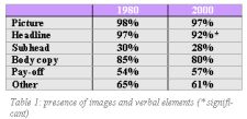
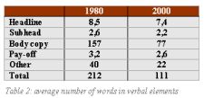
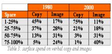
At first sight, nothing seemed to have changed. In 1980 and 2000 almost every ad contained a picture and text. The presence of the five analyzed verbal elements, headline, subhead, body copy, pay-off and 'other' (including address and coupons), had not changed either, except for a small decline of ads with a headline (see Table 1). Nevertheless, an obvious shift from verbal prominence towards visual prominence was observed. In 2000, images were more prominently present then in 1980, because of the decline in the number of words in all verbal components (see Table 2) and because of the the decline in surface taken by the verbal copy. Especially the surface of the headlines and bodycopy declined. As a result, the surface of pictures in ads increased (see Table 3). The increased significance of the images was also shown through the decline of ads with the headline and body copy positioned on top of the image. The position of the pay-off did not change, in 1980 as well as in 2000 the pay-off was located mostly under the image. The change towards an increase in visual prominence and less verbal copy in magazine ads already started before 1980, but persevered in a slightly different way in 2000.
 |
|
Less obvious
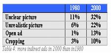
What does the development of more prominent images and less verbal copy in ads mean for the consumer? The content analysis showed that in 2000 ads communicate in a more indirect way. In 2000, ads were less clear, less realistic and less explanatory (more open) than they were in 1980 (see Table 4). The number of rhetorical figures increased substantiously too. For example, 'cropping' (the partial portrayal of a person or product) increased with seven percent. Consumers probably had to use more cognitive energy in 2000 than in 1980 to be able to understand the ad, although most ads in 2000 still provided some explanation. Almost all ads in 2000 contained verbal copy helping the consumer to construct an interpretation. However, this helping of the consumer in interpreting the ad's message became more indirect. The headline as well as the bodycopy explained the image far less; the reader was only guided to a certain interpretation. Because of the decline of verbal explanantion consumers had to search harder for an interpretation in the picture, that also became more puzzling.
|
|
Searching for product
Verbal product depiction decreased in 2000. The decrease in verbal product depiction was observed in all verbal elements. In addition, product portrayal declined (from 89% to 68%). Product-information also declined in the headline, pay-off and image, although the body copy almost always contained product-information (in 1980 as well as in 2000). Because product presence declined, brand presence might have increased. However, the presence of the brand in the verbal copy and in the images hardly changed between 1980 and 2000. The brand was mainly referred to in the bodycopy. What did strike attention was that in 2000 the brandname, with or without logo, was depicted more often separately in the ad (increase from 69% to 86%). The surface of the brand did not change (almost always 1-5% of the total ad surface in 1980 and 2000).
Differences between products
Previous studies revealed differences in visual-verbal prominence between ads for different products. It seemed that in the period 1910-1980 ads for products like alcohol, perfume and tobacco contained less verbal copy and more images than the average ad, whereas ads for other products, like cars, contained more verbal copy. Our content analysis showed the same differences; in 1980 ads for tobacco and perfume frequently contained images, which resulted in very small differences in presence of images between 1980 and 2000 for these products. In future research differences between product categories will be further examined as well as differences between brands.

|
A new visual language
As expected, ads focus more on images and less on verbal copy. Advertisers also seem to communicate in a less direct way. The commercial message is less imposed upon the reader. In 2000 advertisers apperently seem to expect that consumers are more capable of retrieving the message from the picture in the ad themselves. It is also possible that the consumer was already capable to extract these messages from pictures in 1980, but that the advertiser underestimated the consumer by not using puzzling images in 1980. According to researcher Loef (2002), consumers' expectations of ads play a key role in the perception and information-processing of ads. Because of the increased visual and indirect way of advertising, expectations of consumers probably have adapted in accordance with these changes. However, this is only the case when magazines do not differ in the amount of visual and indirect ads. Although our research hardly revealed any differences between magazines, it is plausible that visual riddle ads occur mostly in trendy (more visual) magazines. New 'trendy' magazines were not selected for the content analysis, because they didn't exist in 1980. Therefore, future research may focus on different types of magazines. Can we expect more puzzling ads in the near future? Yes and no. Visual and puzzling ads seem to be highly appreciated in the advertising branch, seem to win international advertising awards and are often selected and discussed in advertising magazines (e.g., Luerzers archive). The trend towards more riddles and more prominent images shall probably continue for a while, but a reaction will also not fail to occur. Undoubtedly, verbal copy ads with obvious messages will appear more often in magazines. After all, you need to attract attention!
Gisbergen, M. S., Ketelaar, P. E., & Pieters, M. (2003). A new visual language in advertising.
Changes in magazine ads between 1980 and 2000. Tijdschrift voor Marketing, 10(37), p.76-78
|
|